They can’t hide it any more. I have written previously about how NSW health manipulated their data when the “it reduces infection risk by 95%” became an obvious con (that our public health tsars failed to see). Then it became obvious that even hospitalisations and deaths were not being reduced by the roll out of novel “vaccines” in this article that reminded us that the money follows the influence:
https://arkmedic.substack.com/p/how-to-lie-with-statistics
So what has happened?
Well, TLDR – nearly everybody dying of COVID-19 (and there are a lot) is either triple, quadruple or multiple-double-mega-booster vaccinated. And I’m going to show why it’s a problem using their own methods of “vaccine effectiveness” calculation.
We all will now be familiar with this kind of article from one of the kings of COVID propaganda, David Spiegelhalter, in The Socialist Worker Guardian Observer1

Essentially the argument goes something like this:
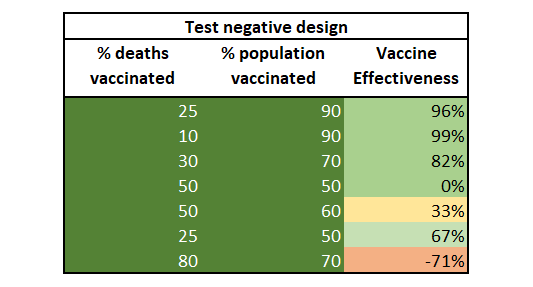
If 50% of your population is vaccinated and only 25% of the deaths are in vaccinated people your vaccine effectiveness against death is a useful 67% (0.5/0.75). Therefore as the vaccination rate goes up to high percentages you are going to see a lot of vaccinated people die. To illustrate the point better I will show below a sample of various percentages in the “affected” population and the “background” population on which the calculation can be made and the calculated “vaccine effectiveness” in the population studied.

In order to calculate vaccine effectiveness (efficacy in real world use) you use the formula:
VE = 1 – [ ( Rv / (1-Rv) ) x (1-Rp) / Rp) ]
where
Rv = proportion of vaccinated in the subject of interest (death, infection)
Rp = proportion of vaccinated in the general population
and both are decimals in the range 0 → 1
It sounds smart doesn’t it? You only need two pieces of information – the proportion of people in the population and the proportional of people in the subject of interest (e.g. proportion of deaths who are vaccinated, proportion of infections who are vaccinated).
Anybody that has been paying attention so far will realise that nothing is that simple and shortcuts have consequences. In particular with test-negative designs the main problem is selection bias as outlined here (as well as other critiques).

One example of this could be where 80% of your population is vaccinated but only 50% of the deaths are vaccinated, giving a VE of 57% against death. But in this scenario it could be that vaccinated people are not tested for COVID as often as unvaccinated people (this has happened), so the real % of deaths of vaccinated people is actually 70%. The VE would then drop to 42%.
Another example of where this could misrepresent the real data is if there was a categorisation lag, such that the vaccinated are only called vaccinated if they have passed “x weeks since vaccination”. This was shown to account for more or less all the “efficacy” in the Dagan Pfizer vaccine study in Mark Reeder’s excellent analysis.
So, what’s happened in NSW? The good thing is that, although difficult to find, NSW has continued to produce data around the vaccination status of those who died with COVID in 2022 (and there have been a lot). The reports are here (but we have archived them too). This is the latest report showing that 86% of known vaccination status deaths were in the 3+ dose population (62/72).

You’ll hopefully remember that there is a problem with the “no dose deaths” number which is the only number that is higher than the “admitted to hospital” number. It’s therefore either a transposition (deliberately swapped from the unknown) or else it suggests that NSW out-of-hospital unvaccinated people are being denied hospital treatment. That’s a discussion for another day and another trial (of the non-scientific sort, in due course).
So we can deal with this data in two ways – either accept the NSW health data as is, or else make an assumption that the number of deaths in any category cannot be higher than the number of hospitalisation cases. There are a few good reasons why this is likely to be a reasonable assumption but the obvious one is that there is no category other than “unvaccinated” where this happens and so the probability that there is a genuine situation where “number of deaths > number of hospitalisations” is zero. In any case, let’s look at both options.
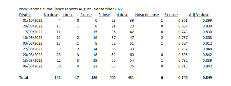
So here is the data collated directly from the NSW vaccine surveillance reports for August and September 2022.

The three columns at the end need explaining:
”Hosp no dose” is the number of patients listed as hospitalised with no dose in that week’s report
”3+ dose %” is the proportion of patients with known vaccine status who had 3, 4 or more doses in that week’s report
”Adj 3+ dose” is the proportion of patients with known vaccine status who had 3+ doses but interpolating by replacing the inaccurate “no dose” number with the maximum possible number of “no dose deaths” based on the hospitalisation number in that week’s report
So now we have this data we can look at the vaccine effectiveness against death, using NSW Health’s own “test negative” design methods. In order to do that we need the proportion of the population vaccinated (the Rp in the above calculation) – which has remained relatively stable for a few weeks. Bear in mind that nearly all COVID-19 deaths are in adults so the closest that we can get to this data is in the “over 16” population – which you can download here (copied below).
Covid 19 Vaccination Vaccination Data 29 September 2022 (1) 2.68MB ∙ XLSX File – Download
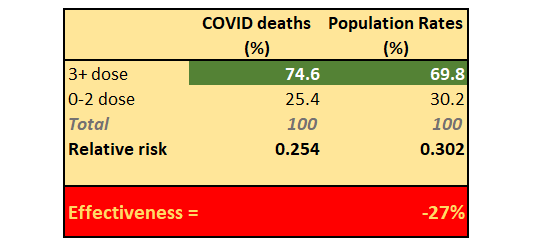
Here is a snapshot of that data today giving a 3+ dose vaccination rate of 69.8%

Using NSW health’s rather suspicious “more deaths than hospitalisations” data we get a rate of 74.6% of deaths in the 3+ dose group and using the above method we get2:

Yes you read that right. This is a negative vaccine effectiveness for preventing death after 3 or more doses of the “vaccine”. This is the vaccine remember that was meant to prevent symptomatic disease by 95% and when this flopped and the infection rate went ballistic the NSW health bureaucrats changed the goal posts to “it prevents severe disease and death”.
Well I’m sorry but it was a lie. And it gets worse.
When adjusting the “no dose deaths” correctly to have a maximal value of the number of hospitalisations for that group in that week (because none of the other vaccination status categories come anywhere near close to that number)… we get this.

That’s right.
When adjusting for exaggerated zero-dose data the vaccine effectiveness to prevent death from COVID-19, using NSW health’s own test-negative methodology, shows a NEGATIVE effectiveness of 143%.
That is, the risk of dying of COVID in the 3+ dosed population is over twice that of the population with 2,1, or 0 doses.
There isn’t much more to say is there? So I’ll just leave you with a picture of the two most influential people responsible for this humanitarian and human rights disaster. The two people that were primarily responsible for enforcing mandates for experimental therapies on the population of New South Wales Australia, 75 years after the world promised never to do it again.

The Guardian group of newspapers has always had a reputation for far-left extremism which is essentially a cover for slavery of the masses. It has history in this regard that should be known by its readers before signing up for a regular subscription as it was founded by slave owners (a relative rarity in 19th century England).
https://www.thesun.co.uk/news/11864739/lincoln-guardian-shut-down/
The “relative risk” in these two charts refers to the relative proportions of the “untreated” arm in the populations. It is there to provide an idea of how the risks of being “untreated” (in this case 0-2 doses) compare between the groups.
Source – https://arkmedic.substack.com/p/bombshell-nsw-vaccine-reports-confirm
