
I stole the following graphic from a Meryl Nass article. What does it tell us?
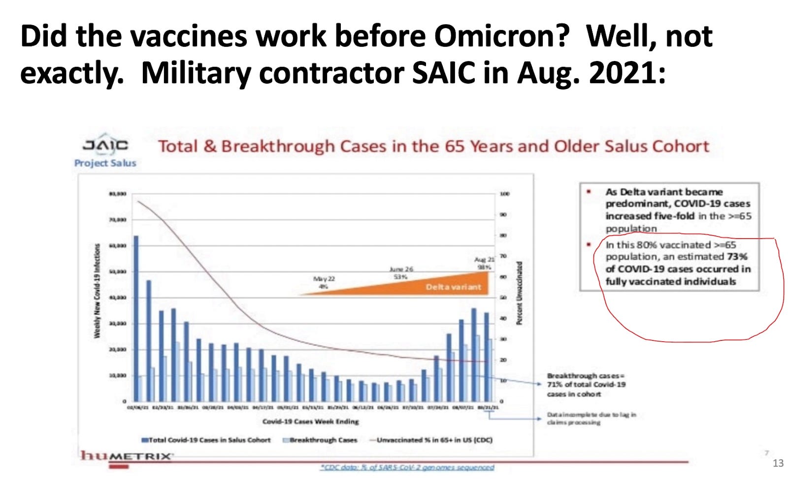
It looks like Meryl did some napkin math:
merylnass:Now Fleming-Dutra presents and gives the commercial that everyone should stay up to date with the vaccine and pregant and breastfeeding women should especially get it. What? Her data claim the vaccine worked wonderfully for Delta. But here is some DOD contractor data on Delta in the vaccinated elders—about 10% benefit
I wanted to see for myself, so I ran the numbers myself. Understand that I estimated points in the chart above, but I think I did an okay job. Somebody with better eyeballs can check my work.
Meryl’s napkin math checks out. I compute a naive vaccine effectiveness (VE) rate of 11.4%.
However, that’s without the proper adjustment! This VE fails to account for risk-adjustment of person days:
The way to correct the study is to multiply each person day by the risk factor of the endpoint that we’re measuring. That creates the numbers in the “risk-adjusted” columns above. Without that correction factor, we make two cohorts of essentially identical risk (well, maybe taller people have a slightly harder time ducking for cover?) look as though they have vastly different outcomes.
Our naive VE also doesn’t take the possibility of the well known “healthy user bias” (HUB) into account. Since HUB is positive, but unknown in this case, and it is likely a smaller size than usual for such a defined demographic, I’ll ignore it. But since I’ve seen risk-adjustment of person days make a substantial difference in the past, I might as well correct for it by normalizing the data as if infection rates were constant.
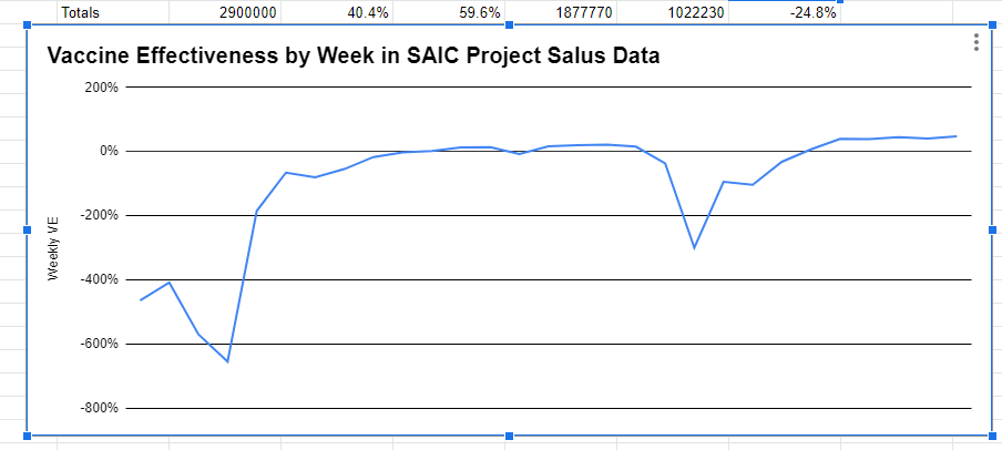
Forgive the garbage g-spreadsheet diagram. What we see is very close to zero efficacy during most weeks, but vastly negative efficacy at the outset of the vaccination campaign. The brief dip is during the low-point when my ability to properly estimate got challenged by the pixel sizes.
The true VE after risk-adjustment is -24.8% on average. But a better description might be something like, “The first couple of weeks are tough before the vaccines become useless.”
Addendum
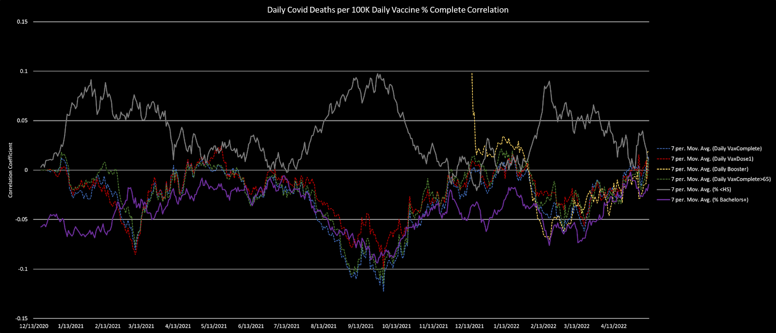
It’s worth pointing out how this zero efficacy result (close to a flat line if we smooth my work above) matches prior observations that county level data shows VE tracking HUB very tightly.
In an email [I need you to know that I’m a] Biostatistics Professor Jeffrey Morris says he doesn’t see how I made my risk adjustment, but the normalization was very basic and standard. I think he just didn’t bother to click on the spreadsheet link I provided. Then he sort of mumbled something out about how all the other studies show positive VE without committing to citations.
Other Vaccine articles can be found here.
Source – https://roundingtheearth.substack.com/p/the-saic-data-shows-zero-vaccine