
We can now see very clearly what is going on. Shot #1 bumps your risk of death by around 20%. Shot # 2 bumps it another 20%. Shot #3 bumps your risk another 10%.
For a normal vaccine, the curve in deaths per day should be a flat line. It is NOT supposed to rise over time. For other, more established vaccines, there is a peak on day 0, then the “curve” is simply a completely flat line with NO slope.
The healthy vaccinee effect is apparently non-existent for Medicare patients; we don’t see it for other vaccines (NO DELAY at all: reaches flatline IMMEDIATELY).
The steady state level of the distributions below is lower than normal all-cause mortality which suggests that the vaccine is a fountain of youth for everyone who takes it for the first 300 days. Specifically, I learned after I wrote this article that there were 29,673,699 Medicare participants who took the shot in 2021. That group should have a steady state death rate of between 2.5% and 2.8% per year just from normal causes (2017 – 2019). Taking the lower number, the steady state death rate has to be at least 2,032 deaths per day which is the lowest pre-COVID. That minimum possible rate should happen immediately after the jab. If the jabs are working, we’ll see lower “bumps” due to COVID outbreaks than we normally would without the jabs. This is much easier to see when we restrict the vaccine dates to a specific quarter (the humps will move).
The vaccine is only reported to save COVID deaths, not save all-cause deaths.
So there is something wrong with the data and I’m still sorting that through. The slow rise over the first 14 days is a big mystery; we don’t see that for other vaccines given to the same age group in Medicare.
So take the data and the analysis below with a grain of salt.
I’ve left the article intact in the hopes that it can be useful to understanding what is going on.
Executive summary
I’m still gathering data from Medicare, but a consistent picture is emerging for Medicare participants under 80 years old:
- Shot #1 increases your risk of death by around 20% with an exponential time constant of around 150 days.
- Shot #2 increases your risk of death by an additional 20% with a time constant of around 100 days.
- Shot #3 increases your risk of death by an additional 10% with a time constant of around 50 days.
- Due to the limitations of the Medicare data (missing vaccination data on nearly half the records), it’s not clear whether the shots reduce your risk of death from COVID. We need data that the public health authorities refuse to provide. If the shots worked, they’d want to make this data public. Keeping the data under wraps suggests that the shots not only make you more likely to die from all causes, but they also make you more likely to die from COVID.
The data
Here’s the data. I’ll explain more in the next section.
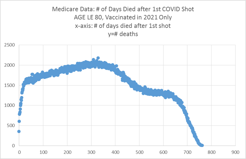
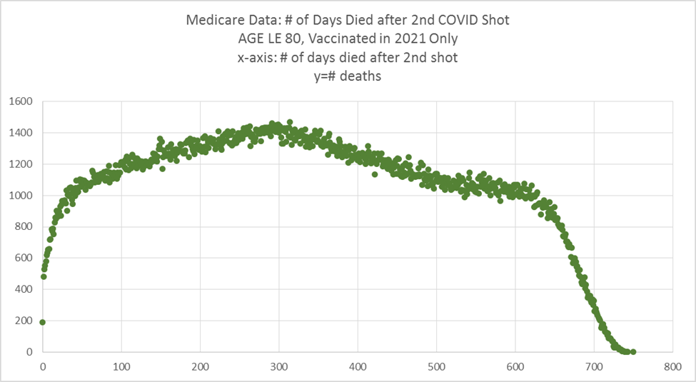
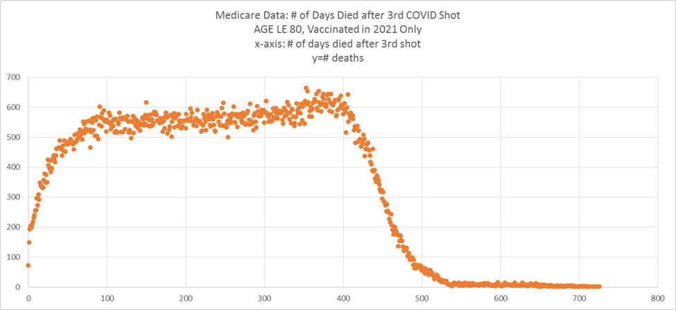
The hump at 375 is seasonality and/or COVID effects. The vaccines themselves do not produce a “hump.” We know this because we did graphs where we looked a people vaccinated in different quarters and the hump shifted accordingly.
About the data
This is Medicare death data for those under 80 years old pulled from all 50 states.
The graphs are deaths after vaccine shot #N by day. So an x-axis value of100 means you died 100 days after you got that shot # and the vertical axis is the count of deaths at that time distance from that shot number.
The charts count all people who were vaccinated with the specific shot number sometime in 2021.
The effects of COVID spikes are smoothed out here due to the time window of the vaccine shots being spread so there aren’t “peaks” due to COVID outbreaks.
Since most older people were given their first vaccines in Q1 of 2021, there is a small seasonal spike around 300 days after the shots because older people die more often in the winter. That spike may also be from the COVID death surge in Jan 2022.
Data source
Legal counsel has advised me not to release the data.
If you want to see the data, you should publicly call for the owners of the data to release it. There is no legal reason they can’t release it.
But they won’t ever do that because it would reveal the truth and embarrass too many people in government who called for these shots to be given but never wanted to see the data.
In Ohio, for example, the death records were public. Then COVID hit. Now you can’t get the death records.
Every honest member of the medical community should be calling for data transparency.
Yet, as of February 9, 2023, John Beaudoin and I have been, to my knowledge, the only people in the world publicly calling for data transparency.
My interpretation of the results
My interpretation of the data above is based not just on this data, but extensive analysis of the Medicare data that I’ve done that is not described here.
Here’s what I believe is happening:
- In the first 20 days or so, we have a healthy vaccinee effect operating, i.e., they don’t inject people who they believe are about to die. That’s the big slope at the start with a short time constant of around 8 days. Death counts are also low because of a startup effect where if they inject you, and you are seriously injured, they’ll try to keep you alive before they give up and you’re officially dead. So after around 20 days, we’re at the “baseline” normal death rate.
- The drug starts working on you making you more and more likely to die over time starting from when you are injected. For the first dose, it looks like a time constant of around 150 days with a final value of around 20% above baseline death rate (without the vaccine). For shot #2, it seems to be a shorter time constant (around 100 days), and an endpoint 20% higher. So for the two shots combined, you are raising your risk of death by around 40%. The third shot acts faster to raise your risk of dying, but the endpoint is only around 10% above your previous baseline. So after your third shot, if you are old, you’ve raised your risk of death by around 50%.
- While these numbers seem impossibly high, consider that I know of a geriatric practice with 1,000 patients where the death rate was 11 deaths a year and in 2022, they had 39 deaths. They attribute all of the excess deaths to the vaccine. A funeral service in California that I recently talked to doubled his business in 2022. And many embalmers report 40% or more of their cases have these mystery clots. I know of a nursing home in Australia where the death rate went from 2% per year to over 20% in the 12 months after the vaccines rolled out. So I find it puzzling that the death numbers in the US appear to only be up by less than 20%.
- The drop offs you see in the charts after 360 days is because the time window of the shots is 1 year and we only looked at deaths till the end of 2022. Thus, we simply run out of time. The graphs limit you to vaccination in 2021 meaning ONLY the first 365 days are going to be “flat.”
- Pro-vaxers could argue these graphs by claiming, “Oh look, the vaccines save you from dying for a year and then they wear off.” I’ve explored that and it’s not true. COVID kills in waves and when we restrict the vax window we look at, we can see the COVID peaks on top of the graph. Whether or not those peaks might have been higher if the person wasn’t vaccinated is something we can see if we can get the full dataset of who was vaccinated and who wasn’t so we can compare the peaks of vaccinated people with the peaks of unvaccinated people. That will tell us if there is any benefit to the vaccines at all; I wouldn’t be surprised if the peaks are higher for the vaxxed than the unvaxxed.
Have you looked at the excess deaths in the US lately?
The fact that 2021 and 2022 were excess death years suggests our main intervention made things worse, not better. And the 2022 numbers are incomplete according to the CDC. This is very unusual for excess deaths to be up like this.
Usually, when you have a year with excess deaths, it is followed by a year of deficit deaths due to the depletion effect.
And we can see that COVID deaths have been very low since April 1, 2022:
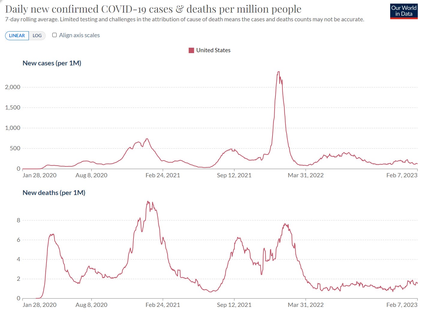
This suggests something is at work that is causing excess deaths and it is not COVID. Hmmmm… wonder what it could be???? Hmmmm… gotta think about that one.
Summary
The shots increase your risk of death with every shot you take. The COVID vaccines aren’t safe for anyone.
It remains troubling to me why the authorities don’t release the data so everyone can see what is going on.
It is even more troubling that nobody in the mainstream medical community is calling for data transparency so that people will know the truth.
The only reason for keeping people in the dark about the COVID death/vax data is if the numbers would make the medical medical community look inept for supporting the vaccination program.
Mark my words: they will not be able to keep hiding the data.
When the data is finally set free, the entire medical community will be discredited, along with Congress, the White House, the mainstream media, high tech companies that continue to censor doctors trying to spread the truth, public health officials all over the world, and numerous State leaders, lawmakers, companies, universities, and organizations that required these vaccines in order to participate in society or keep a job.
Source – https://stevekirsch.substack.com/p/exclusive-stunning-new-data-pulled