
It is said that people can only worry about one thing at a time; if so, then I’m sure that few people are currently worrying about the recent increase in Covid cases in the U.K. This is a good thing – the hospitalisation and mortality rates of Omicron appear to be significantly lower than those of previous variants, so it’s surely time to just accept Covid as another type of cold that’ll give us all an annoying sniffle every couple of years.
But the sticky problem of the vaccines remains. Do they work or have they made things worse? Luckily, the UKHSA (just about) continues to publish the Vaccine Surveillance Report and as a result we can explore how the vaccines are impacting on Covid in England.
Cases
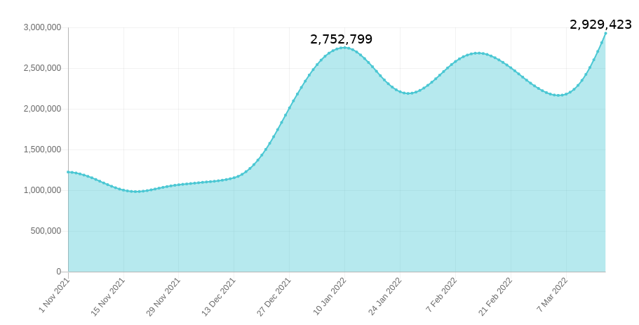
The new Covid wave, as defined by data from the Government Covid dashboard, appears to be gathering steam with new cases hitting 100,000 per day; it is easy to forget that the terrible Covid wave during January 2021 peaked at around 60,000 new cases per day (though this was admittedly before mass lateral flow testing had been brought in). We’re told that recent variants are nearly as infectious as measles – ignoring the surprisingly low household infection rate of Omicron variant, which doesn’t support the measles comparison. What do the data say?
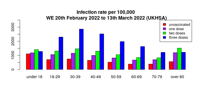
Yet again, the real-world data suggest that infection rates are generally highest in the triple vaccinated, with the lowest infection rates in the unvaccinated (see here for details on methodology and limitations). Could it be that the evidence for Omicron variant being as infectious as measles is only found in countries with high vaccination rates?
The delayed nature of the UKHSA data meant that in last week’s report there was no sign of the then emerging Covid wave – the question is, can we now see the latest Covid wave in the UKHSA data? Looking at all the weekly totals for all Covid cases there’s a hint of an uplift for most age groups in this week’s report.
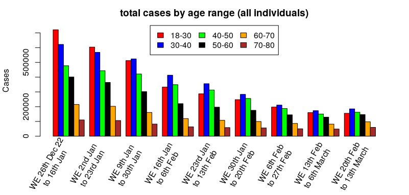
Hmm. The cases have definitely dropped significantly since the beginning of the year, but it’s a bit difficult to see if it is turning around – how about looking at the percentage change by week, that is, relatively how many more/fewer cases there are compared to the previous week:
That’s better – cases appear to have been dropping since the start of the year, but this week’s report suggests that the reduction in overall cases has stopped and perhaps the start of the new wave can be seen at the far right.
What about by vaccination status?
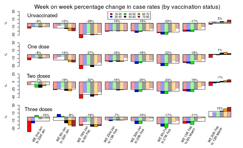
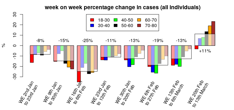
Hmm. That’s a busy graph, but perhaps if you stare at it for long enough a general pattern should become visible.
The change in cases for the unvaccinated, those with only a single vaccine dose and those with a double vaccine dose are very similar; a sustained reduction in cases since the start of the year, but with cases remaining broadly flat in this week’s data compared with last week’s.
Three doses of vaccine show a very different picture. Compared with the unvaccinated or those with one or two doses, the data for three doses show a much slower rate of reduction in cases, with generally about half the rate of reduction in cases compared with those that had taken fewer doses. Also note that this isn’t simply because the triple vaccinated had fewer cases; a glance at the cases graph earlier in this post clearly shows that case rates in the triple vaccinated are still higher than the unvaccinated, and previous posts have shown similar data for earlier time periods.
The big difference in the triple vaccinated, however, is in that final time period on the graph above (the column on the far right); in the latest data we can see that case rates have recently been broadly flat in the unvaccinated, the single dosed and the double dosed – but in the triple vaccinated we see a significant (15%) increase in case rate. It is noteworthy that the triple vaccinated make up the majority of the population for most age groups; are our new Covid waves being driven by the triple vaccinated?
These are still early days in the progression of the current Covid wave and this analysis should be regarded as preliminary – next week’s data should be interesting, if they provide it…
One more note on cases. I mentioned last week that the Zoe symptom tracker was disagreeing with the UKHSA and U.K. Government data on the drop in cases that we’ve seen over the last two months. The Zoe Symptom tracker has seen a sustained level of cases during that time (I have hypothesised that this is due to the 90 day exclusion period in the UKHSA data that would remove any reinfections). I mention Zoe because Thursday marked the point where the Zoe app’s estimate of the number of individuals currently infected with Covid in the U.K. exceeded the case rate during January, and with no sign yet of the increase in cases starting to reach a peak.
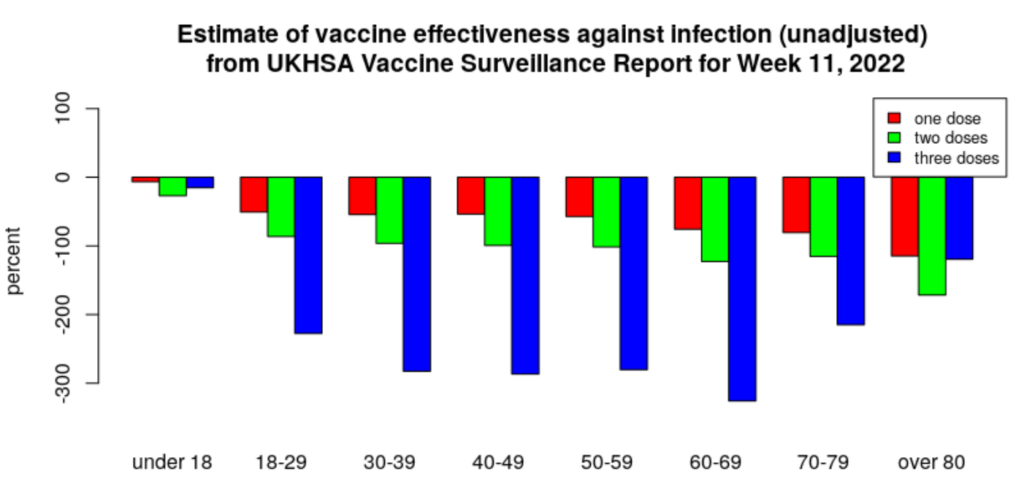
For the historical record, this is the current estimate of vaccine effectiveness according to the UKHSA data.
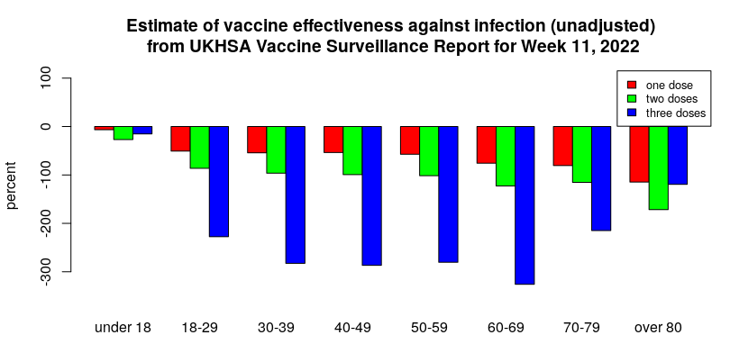
All are negative, meaning the infection rate in the vaccinated is higher than in the unvaccinated. It has reached as low as minus 300% for the triple-jabbed aged 30-70, with those in their 60s faring worst of all, meaning these groups are more than four times as likely to test positive as their unvaccinated counterparts.
Hospitalisations
The Covid vaccines appear still to be offering some protection against hospitalisation after Covid infection for those that were recently boosted, but the hospitalisation rate in those that stuck with one or two doses of vaccine is now much higher than that of the unvaccinated.
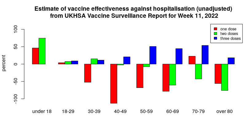
I’d note that it is possible that the higher risk of hospitalisation in those having taken only one or two doses of vaccine reflects them being more vulnerable than average (and thus passed over for the booster dose). If so, this ‘healthy vaccinee’ effect implies that the vaccine effectiveness against hospitalisation and death will be overestimated. That said, there remains the possibility that waning vaccine protection starts to be associated with increased risk of serious disease (possibly via antibody-dependent enhancement (ADE) mechanisms, which often only appear when the initial immune response starts to wane). It would be useful if some research was undertaken in this area.
An important aspect of the above graph is which age groups get the benefit of reduced hospitalisation after vaccination. The age group from 50 to 80 appears to have a reasonable level of protection (about 50%) and this might well support vaccination in that age range for those that are happy to keep on taking booster doses indefinitely (dependent on side-effect/complication rates). Protection in those aged over 80 appears to be poor – this is unfortunate as it is that age group that gets the largest share of hospitalisations and deaths. I also note that there appears to be very little reduction in hospitalisation in those aged under 50; it is questionable whether this level of reduction is at all relevant for younger individuals.
Deaths
The UKHSA statistics for deaths within 60 days of a positive test show a similar trend for the effectiveness of the vaccines to that seen for hospitalisations (only data for those aged over 40 are shown – Covid death rates are too low in those aged under 40 for meaningful analysis).
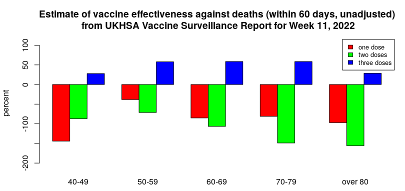
It is important to note that deaths with Covid have reduced significantly since the Omicron variant arrived. Thus, despite the apparent protection against Covid death offered by three doses of vaccine, it is questionable whether there is now much in the way of absolute, real-world benefit.
There is a worrying trend in the deaths data, however – the change in distribution between deaths within 28 days and within 60 days.
Historically, most deaths with Covid have occurred within 28 days of infection. However, there have been some additional deaths beyond this point; in general, each week’s report has seen an additional 20-25% deaths with Covid between 28 and 60 days after infection.
Over the past few weeks, the proportion of deaths with Covid in the 28 to 60 day period after infection has steadily risen until it accounts for approximately as many deaths again, as seen in the graph below.
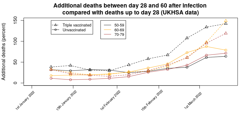
Even worse, there appears to be a vaccine effect, whereby there are more additional deaths in the triple vaccinated group (approximately 140% of the 0-28 day deaths in the latest report i.e., nearly one and a half times as many deaths occurred in the 28-60 day period as in the 0-28 day period) compared with the unvaccinated (approximately 70% of the 0-28 day deaths i.e, the number of deaths occurring in the 28-60 day period was around two thirds of the number occurring in the 0-28 day period). This means that in the triple-vaccinated we’re seeing more deaths with Covid in the 28-60 day period than in the 0-28 day period. This effect is also visible in the data for one or two vaccine doses. For the most recent week the day 28-60 deaths are 130% (single dosed) and 170% (double dosed) of the 0-28 day deaths.
It isn’t clear whether this effect is due to infection with the Omicron variant taking longer to get to the stage where hospitalisation is required, people remaining seriously ill inside hospital for longer, or more people dying outside hospital. It is also possible that this effect is due to changes in treatments being used in hospitals.
Given this effect, it is likely that the current ‘official’ death figures for Covid are now lower than they should be (though I note that ONS excess death estimates have also been low since Omicron arrived), and that official estimates of vaccine effectiveness against death will overestimate the protection offered.
Another interesting effect seen in the deaths data is the ratio between the deaths rate and the hospitalisation rate.
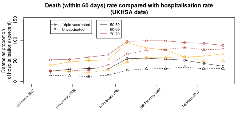
There does seem to have been a change in the number of deaths compared with hospitalisations over recent weeks, with a marked increase in February, so that more are dying per hospitalisation. It is unclear why this has happened. Note that is isn’t simply the hospitalisation death rate – many deaths with Covid appear to be occurring outside a hospital setting. This effect is seen most clearly in the proportion of deaths vs hospitalisations for one and two doses; for those aged 70 to 80 there are more deaths than hospitalisations (about twice as many for a single vaccine dose, about 50% more for the double vaccinated).
One more thing…
Arguably, the most important news in this week’s UKHSA Vaccine Surveillance Report was buried in the text (my bold):
From April 1st 2022, the U.K. Government will no longer provide free universal COVID-19 testing for the general public in England, as set out in the plan for living with COVID-19. Such changes in testing policies affect the ability to robustly monitor COVID-19 cases by vaccination status, therefore, from early April onwards this section of the report will not be updated. Updates to vaccine effectiveness data will continue to be published elsewhere in this report.
This was probably inevitable – the real-world data on the vaccines are consistently failing to support the Government’s position that the vaccines have actually helped significantly. While the excuse given appears reasonable at first glance, a few minutes thought reveals it to be weak – while there might be issues with overall cases and testing, testing at hospitalisation and to a certain extent death will continue. In addition, it is likely that routine testing of healthcare workers will continue for some time. It would have been trivial for the UKHSA to have continued to show data for hospitalisations and deaths and included a section on case rates in healthcare workers. But instead they’re using the occasion as an excuse to remove all data. I also note that the Zoe symptom tracker app has lost funding – their data were also going against the official narrative. Thus, like tractor production in the Soviet Union of old, the only statistics we’ll be allowed to see are those that aren’t inconvenient to the state.
Hopefully we’ll get at least one more set of data to see how the impact of the more recent changes outlined in this post have played out