
NSW is the most populated state in Australia comprising some 8m inhabitants, about a third of the population. It is now world famous for its vaccine mandates that were imposed by Brad Hazzard, their health minister who does not have a medical degree yet prescribed (arguably illegally via mandate) a provisionally approved (restricted use) genomic therapy on the population. So, how did that go?

Well, roll on a few months and pretty much the whole adult population of NSW is “vaccinated”. The official stats are that as of today, according to their own data, 95% of NSW people aged over 15 have received 2 doses of a “covid vaccine” – mostly mRNA therapies.
So, one would like to think that, because NSW health persists in making the claim that “COVID-19 vaccines are very effective in preventing people from the severe impacts of infections with the virus” (which was updated from the original “The COVID-19 vaccines available in Australia are very effective with evidence showing that people who are fully vaccinated are 70–95% less likely to get sick with COVID-19 compared with those who are not vaccinated”.
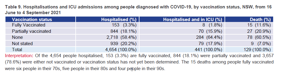
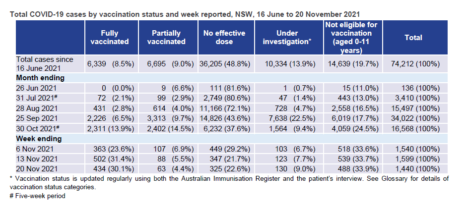
There was just one problem. The hospitalisation data are confounded by a diagnostic bias. The same bias was seen in the UKHSA data which preceded NSW health’s data by a few months because Australia was relatively late to the vaccine party. The bias means that, when somebody arrives in hospital (with any condition) who is unvaccinated they are more likely to be tested for COVID-19 than if they were vaccinated. This arose out of a false belief (later ditched) that the vaccine prevented infection, so obviously the higher quality “clean” patients didn’t need testing (for the reference to clean vs unclean please see my friend Filipe Rafaeli’s excellent article on the Warsaw Ghetto). There was another bias in that data which also related to the fraudulent miscategorisation of recently vaccinated people as “partially vaccinated” or “unvaccinated” for weeks after their vaccine and so the hospitalisation figures for this category took a while to catch up – but catch up they did. In fact, it got so bad that by November the vaccine surveillance reports had to push the figures by vaccination status all the way to the end of the report (just like the UKHSA did), and despite it being a relatively quiet time for COVID-19 infections, the proportion of cases who had received any vaccination had jumped to 63% of the total cases (of those whose status was known).
This was an embarrassment for the NSW goverment who had just been taken to the NSW Supreme Court on the basis of their vaccine mandates (because obviously you have to mandate things that are so good there can be no question of their effectiveness and safety). And worse, Christmas was coming and despite the mandates and Brad Hazzard’s regular rants on TV not everybody was getting all their vaccines, presumably because they could see that they were not exactly doing what the government promised they would do.
So now comes the biggest bait and switch in COVID-19 reporting data ever. Check these tables from the 18th December 2021 to 4th January 2022 reports. Bear in mind that this is the time that cases really started ramping up in NSW, just as the “booster” rollout was gaining steam. Yes, another coincidence.
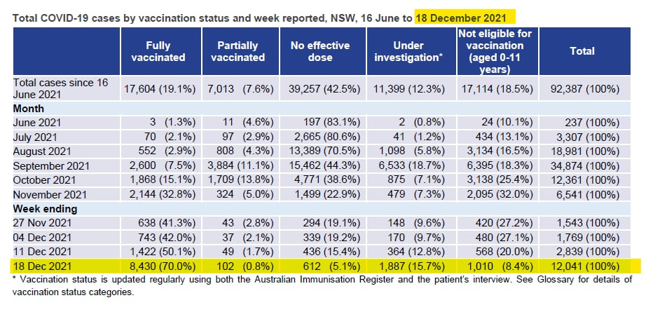
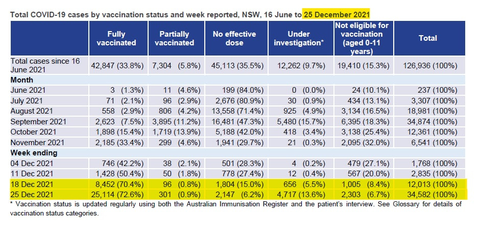
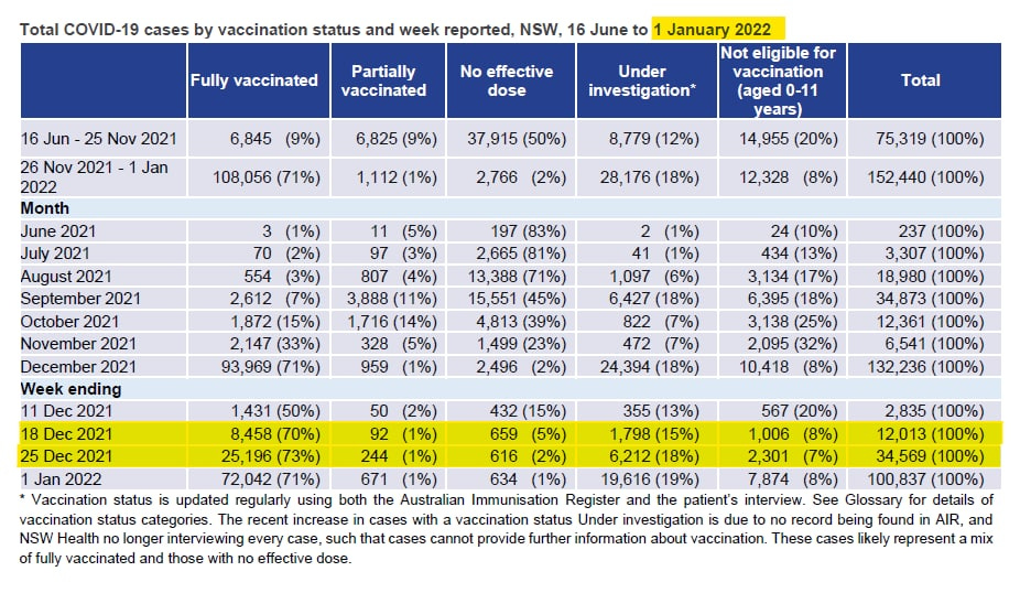
If you look carefully you will see that in the report up to 25th December (the middle graphic) pretty much all the “Under investigation” cases were shifted to the “No effective dose” group and this occurred after our friendly mice army on twitter had pointed out that by 18th Dec the unvaccinated were now accounting for only 6.7% (612/9144) of the total of known status cases. At the same time the case rate in the fully vaccinated had exploded jumping from 1428 to 8452 to 25114 week on week and the government’s bait and switch turned to “protecting you from going to ICU” . The more eagle eyed of you will note that the 7th January report (with the 25th December figures) was then quietly corrected by shifting the “unknown” cases back where they belonged, in the 13th January report (final graphic) by which time the switch away from “stopping infection” to “reducing the chance of severe COVID” was complete. Good play, NSW health.
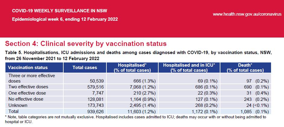
But they didn’t stop there. Now we come to the best bit. You see they had been caught out and therefore needed to change the format of the reports, which has happened a few times – presumably to stop those pesky murine twitterers from pointing out that the vaccine wasn’t doing what they said it would. In fact by the 12th February it became obvious that most of the cases (83% of known), ICU admissions (86%) and deaths (77%) were in the vaccinated and the biases and data manipulations weren’t appeasing the masses.
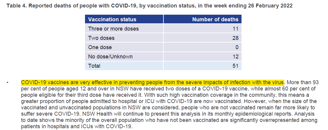
So a quick switch to a new format was required and another version of an old trick – combining the “unknown” and “no dose” was put in place. Oh, and of course now we also need the UKHSA trick of qualifying the data with a long monologue of why it isn’t quite as bad as it looks (because obviously, you prole reader, you don’t know nuffin and we need to edoocate you).
I know, it’s embarrassing. But it gets better. Eventually someone realised that combining the no dose and unknown groups was a fix and demanded – by FOI (please let me know if you have the link to this) – that NSW health provide the data by the actual number of doses received. And this is where the cover-up could be covered-up no more. This is what happened….
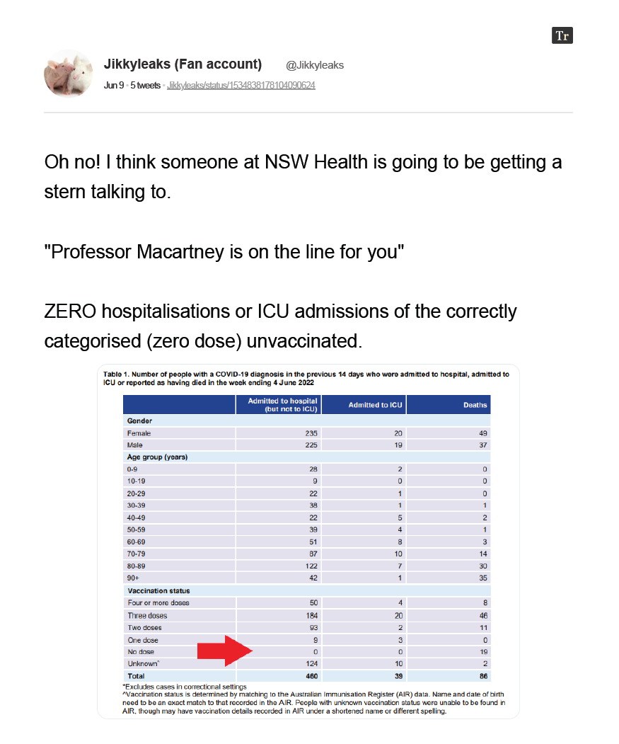
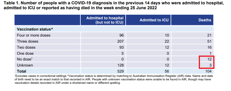
So the hospitalisations and ICU admissions in the unvaccinated dropped to zero (and stayed there all through June, effectively). But wait, there are still a bunch of deaths in the unvaccinated group – how can this be?
We can answer this question by looking at the categorised data over time. So I pulled out every week’s data from these reports manually from the 5th March 2022 to the 25th June 20221. The separation of “no dose/not known” into “no dose” and “not known” took place on the 28th May. All of a sudden, nearly all the deaths that had been categorised in the joint category appeared in the “no dose” group. You can see it happening here2.
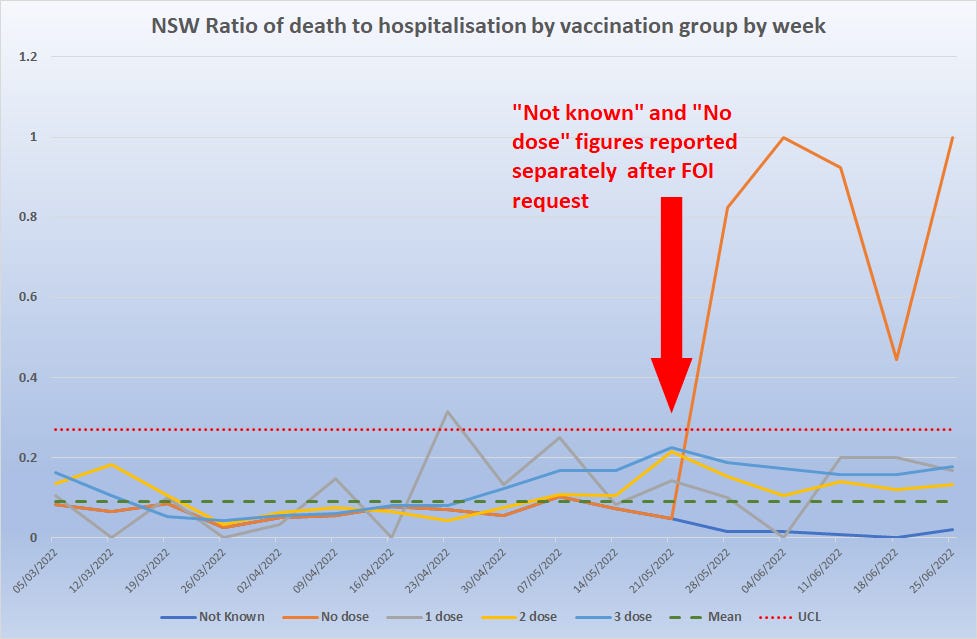
So, we are expected to believe that even though the death rate of every single vaccination category (as a proportion of those hospitalised, irrespective of dose number or unknown status) was below 0.25% – all of a sudden after 28th May the “no dose” category had a death to hospitalisation ratio of 1 (note it was actually more than 1 because there were no hospitalisations in this category for most of June – see note3). Here is another way to look at this amazingly coincidental data:

You don’t need error bars or a degree in medical statistics to see that the “no dose after 28th May” is impossible. So what happened? The logical (and only) explanation is that the death data was manipulated. Either the deaths in the “no dose” category are totally fabricated, the last remaining unvaccinated old people are being killed off in nursing homes and not entering hospital, or more likely that the “no dose” and “unknown” numbers have been swapped. There is no other explanation for this incredible result.
Either way, it’s a misrepresentation of the real data. So I have a question for NSW health’s surveillance data curators (which include the infamous NCIRS)… If this vaccine is so great, why do you need to “fix” the data?
Don’t worry. I don’t expect an answer. The eight million people living in NSW might, though. Given that their taxes and sacrifices have paid your wages, I think they deserve one.
UPDATE 1: It is worth noting that, not only did the mandatory medical interventions (MMIs) fail to stop the spread of the virus, they resulted in the largest spike in overall mortality in Australia’s peacetime history. Well done, public health.
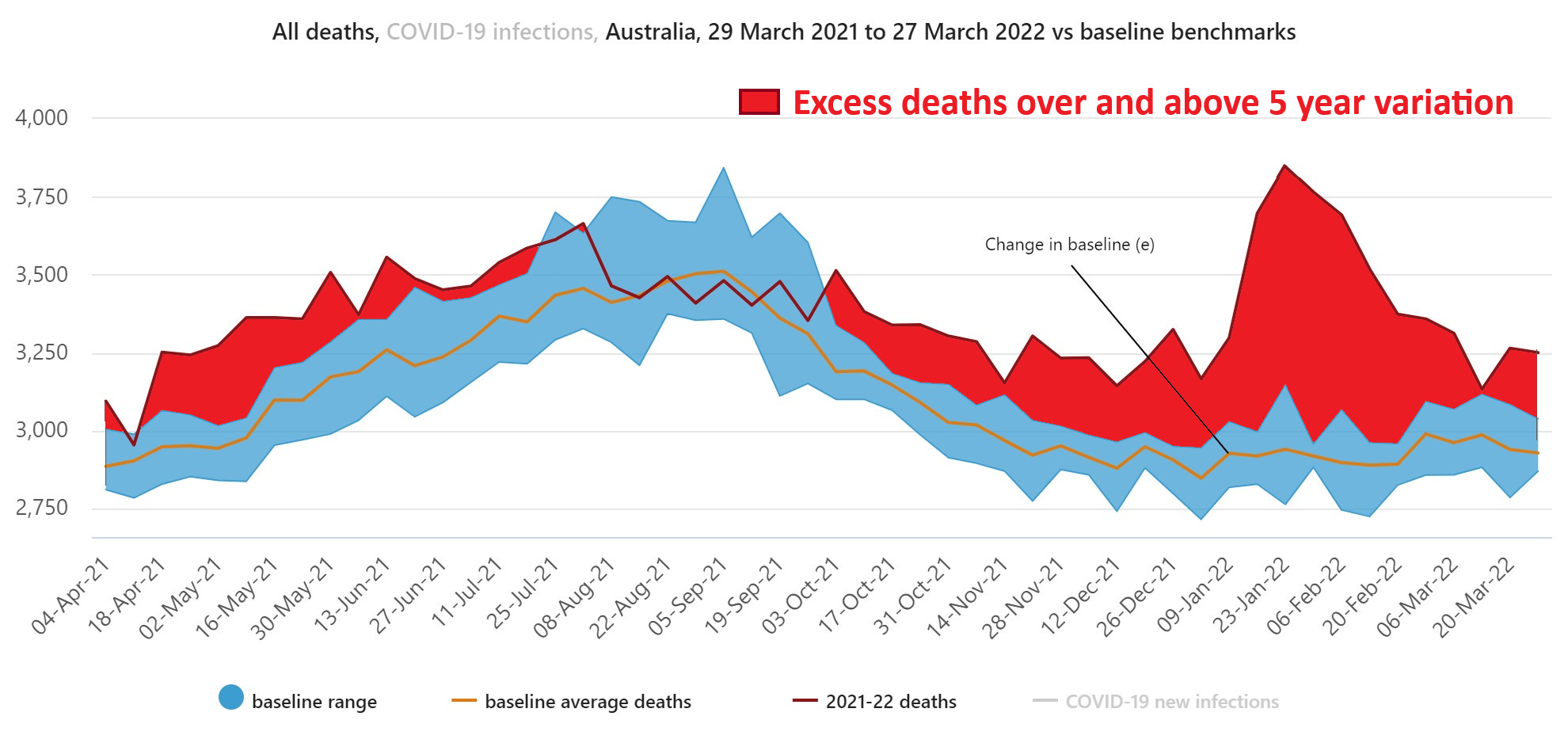
And yes, I have excluded the “COVID-19 infections” from this graph because using “oh but we got another wave of the infection we told you our measures would stop and therefore it’s not our fault that 14,000 people died of things that were a direct consequence of our measures ” doesn’t cut it.
UPDATE 2: If you want to verify this data further the whole repository of the NSW surveillance reports for 2021-2022 is archived here https://t.me/arkmedic/4146
1 https://files.catbox.moe/no1puz.csv
2 The mean and control limits depicted are calculated using arithmetic values, which is an approximation required due to the presence of zeros in the ratios.
3 In order to represent this data without a divide-by-zero mathematical error the simplest and most consistent method was to represent the ratio as:
[deaths] / [(deaths)+(non-ICU hospitalisations)+(ICU hospitalisations)]
Source – https://arkmedic.substack.com/p/nsw-health-manipulated-their-vaccine