New Zealand is a fascinating country – amazing geography, likeable population, and, unlike its neighbour Australia, most of its wildlife isn’t planning on killing you at the slightest opportunity. It is also fascinating with respect to Covid because its population has a very high vaccination rate across all age groups (well, down to five), but up until recently there has been negligible natural immunity to Covid. Because of these two factors, New Zealand was always going to be of interest as soon as Covid arrived properly, if only to see how its vaccination efforts had protected its population.
For those who missed it, since the end of last year New Zealand has had a succession of Covid waves. These started small, but in the most recent wave, taking place during February and March, infection rates were enormous – if we had these infection rates in the U.K. we’d have peaked at approximately 350,000 cases per day (rather than around 200,000). What’s more, it looks like New Zealand exceeded its testing capacity during that wave, suggesting that peak infections were probably even higher. It is relevant to note that during February and March, New Zealand had over 90% of all the cases it has ever had and most of the rest occurred in January – prior to 2022 New Zealand reported very few Covid infections.
So much for the Covid vaccines protecting against infection – but what do the data look like in detail?
Cases
New Zealand is somewhat helpful in that it does publish daily cases, hospitalisations and deaths by vaccine status; somewhat because it doesn’t allow easy access to anything other than the current day’s report. Thankfully, the Wayback Machine ensures that at least some web pages aren’t forever lost to history. These data were collated for dates since mid February 2022 and smoothed with a seven-day moving average to create a time series of Covid cases by vaccine status.

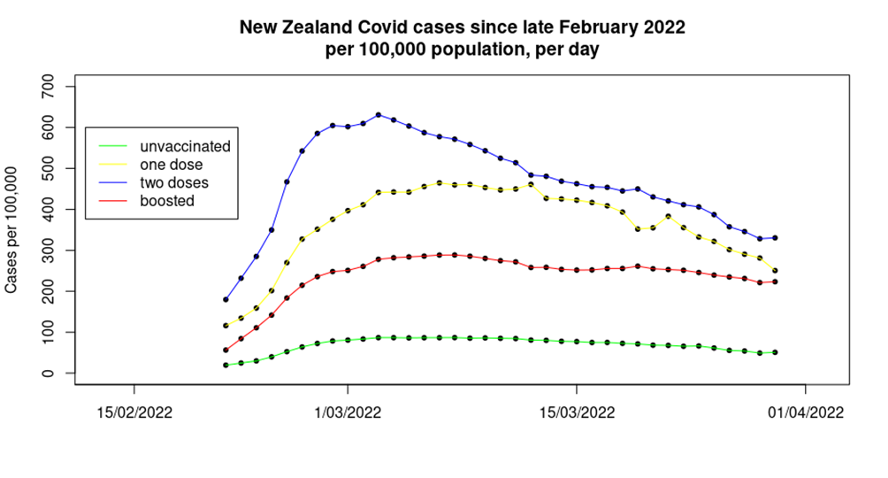
The first time the above graph popped up on my computer screen I had to go and double check all the data sources – and then I triple checked them. The data shown on the graph are notable for several reasons:
- Firstly the obvious one – during the most recent Covid wave there was a much lower infection rate in the unvaccinated, compared with those that had been given one, two or three doses of vaccine. What’s more, this isn’t a small effect – over the period shown approximately:
- 10% of the triple vaccinated in New Zealand were infected.
- 14% of the single vaccinated were infected.
- An astounding 18% of the double vaccinated were infected.
- Yet only 3% of the unvaccinated appear to have been infected.
- The order of the effect is unexpected – for some time in the U.K. the highest case rates have been found in the triple vaccinated, with case rates in the single and double jabbed much lower. In New Zealand the highest rates are seen in the double vaccinated.
- The data for cases in the double dosed appear to have an earlier peak than seen in the data for the unvaccinated, single jabbed and triple jabbed.
- The fall from peak cases to the most recent data point is also interesting. Case rates in the unvaccinated, single dosed and the double dosed have all fallen approximately 45% since their respective peaks, however, case rates in the triple vaccinated have only fallen approximately 20% since their peak. This is rather concerning, as it suggests that we might find that the boosted population maintain a viral reservoir for Covid, ensuring that case rates take much longer to fall to trivial levels and hindering attempts to get society back to a post-Covid normal.
The infections data from New Zealand allow us to estimate the vaccine effectiveness for the Covid vaccines in the absence of natural immunity.

Unadjusted estimates of vaccine effectiveness against infection as at end of March 2022
These data are in contrast to recent data from the U.K., which show one and two doses of vaccine to have a VE of minus-50% to minus-100%, and the booster to have a VE of around minus-300%. While this sounds counterintuitive, it is possible that we’re seeing a complex interplay between a waning of the impact of the vaccine and the impact of additional vaccine doses:
- The U.K. vaccinated early, allowing for the impact of those early vaccine doses to have waned significantly for those choosing not to top-up their ‘protection’.
- The Covid vaccines appear to have a period of approximately two to three months where their impact on the immune system is different than in later periods; this is possibly due to the creation of short-lived IgA (mucosal) antibodies. In the U.K., booster vaccinations were given in autumn 2021, and thus most individuals will have been beyond this period when the Omicron variant’s first wave appeared in December.
In New Zealand, the timescales are very different: those given the booster dose will still be in the two-three month period where short-lived immune responses dominate; those given two doses will be in the proposed period of maximal vaccine negative impact; while those that chose not to accept the offer of a second vaccine dose will be in the period where vaccine effects are waning.
There’s one more point to add for cases in New Zealand, and it relates to the U.K. For months, the UKHSA has been telling us that one possible reason for us seeing far fewer cases in the unvaccinated compared with the vaccinated is because the unvaccinated have natural immunity following high infection rates previously (presumably because the unvaccinated are reckless and didn’t follow lockdown rules – I imagine that they also ride motorcycles too quickly, set off fireworks indoors and play with matches while filling up the car). These data from New Zealand, which at the time had very few individuals previously infected with Covid, show lower case rates in the unvaccinated without any significant levels of natural immunity, contradicting the claim of the UKHSA and eliminating one of its reasons for ignoring the alarming data.
Hospitalisations
Analysis of the hospitalisations data offered by the New Zealand authorities is made complex by there being no stratification of the hospitalisations by age group, and the lack of complete vaccinations data by age. However, U.K. data show that in recent weeks approximately 95% of hospitalisations were in those aged over 60; assuming that this will also hold true for the New Zealand population allows us to offer a indicative analysis of the likely impact for that age group of the vaccines on hospitalisations in the country.
The analysis is also hindered by the data on vaccine coverage for those aged over 60 not differentiating between those that have had only one dose of vaccine and those that are unvaccinated. This might in isolation from other data appear to be ‘sensible’ – after all, the single dosed have the ‘least protection’ as well as ‘the longest time for protection to wane’. However, the data shown in the previous section suggest that the unvaccinated and those having taken a single dose of vaccine are in no way comparable, and that considering them as a single group could lead to misleading conclusions. Nevertheless, that’s the hand that’s been dealt for us.

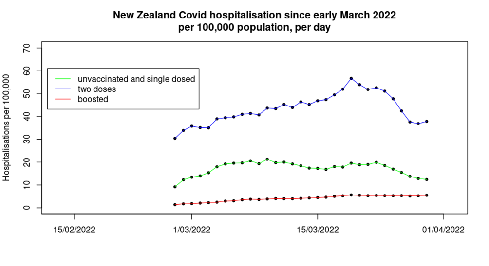
The data are somewhat surprising. While those given a booster dose of vaccine seem to have lower levels of hospitalisations than found in the group containing the unvaccinated and those given only one dose of vaccine – as might be expected – the double dosed have significantly higher hospitalisation rates.
Also interesting is the trend in the data:
- Hospitalisations in the unvaccinated/single-dosed appear to peak earliest – we have also seen this effect in U.K. data, usually in the form of dire warnings early in each Covid wave that the only people being hospitalised are the unvaccinated, only for the warnings to go quiet later in the Covid wave when the data move in the opposite direction.
- Hospitalisations in those given two doses of vaccine appear to peak towards the end of the period shown.
- Hospitalisations in the boosted population appear to show little signs of slowing down, let alone reducing, over the period in question. Note also that this group saw a fourfold increase over the time period shown, whereas the double dose and single-dose/unvaccinated group both saw a 25% increase, albeit with an intermediate period with higher hospitalisation rates.
It was not possible to properly disentangle the hospitalisations data for the unvaccinated, but the data suggest that in aggregate those having taken two or three doses of vaccine (when the two groups are put together) have approximately 45% lower risk of hospitalisation than the unvaccinated/single-dosed. It is worth noting that in the U.K. data we see higher hospitalisation rates in the single vaccinated in those aged over 60, compared with the unvaccinated. It is possible that the same pattern is found in New Zealand, only ‘covered up’ by the co-mingling of the data. If this is the case then the apparent protection offered by the vaccine in the two or three dose individuals will be somewhat lower than 45%.
Deaths
The mortality data from New Zealand are also complicated because the health authorities lump together into one group all the unvaccinated and those having taken a single dose of vaccine. Beyond that complication, deaths data can be tricky to analyse, because there are such huge differences in death rates from (or with) Covid by age. Fortunately, the mortality data offered by the New Zealand authorities do include deaths by age group, which allows a finer analysis than was possible with the infections and hospitalisations data.

Covid mortality per 100,000 per week, by vaccination status and age
The above table suggests that while those given three doses of vaccine have a decreased risk of death from (or with) Covid compared with the mortality rate in the strange group called ‘unvaccinated or one dose’, the risk of death is greatest in those given two doses of vaccine.
However, it is possible that New Zealand’s data have a similar pattern to that seen in the U.K. (and elsewhere), where dose effects are complicated by the health of those given each vaccine, namely that those closest to death were spared a dose of vaccine, and thus concentrated deaths into the very small number left in the prior dose group. A comparison of the data for ‘unvaccinated or one dose’ with ‘two or three doses’ suggests that the vaccines do still protect against death, but only to a very low degree in younger age groups.

Covid mortality per 100,000 per week, by vaccination status and age
The data above support the use of vaccination to protect against death from (or with) Covid for those aged over 80. On the other hand, the mortality rate in those aged under 60 is very low, and the estimated vaccine effectiveness in protecting against death for those aged under 80 is only approximately 30% – once again, the real-world vaccine effectiveness estimate is rather low. It is also of note that these rather poor figures for the protection offered by the vaccines against mortality come from a country that started vaccination rather late (summer 2021) and where most of the population were only given their booster doses two to three months ago. These data suggest that the vaccines simply do not offer substantive protection against death for newer Covid variants, rather than it simply being a case of waning vaccine protection.
It is also important to note that the data on the benefits of the vaccine in protecting against death shown above should be treated with caution:
- Data on deaths in the unvaccinated and those given a single dose of vaccine are co-mingled; the New Zealand hospitalisation data suggest that death rates might be greater in the single-jabbed.
- The vaccinated appear to have significant increased risk of catching Covid, which contributes to overall risk of serious disease and death.
- These calculations do not include any consideration of the risk of side-effects and complications following vaccination.
Overall mortality
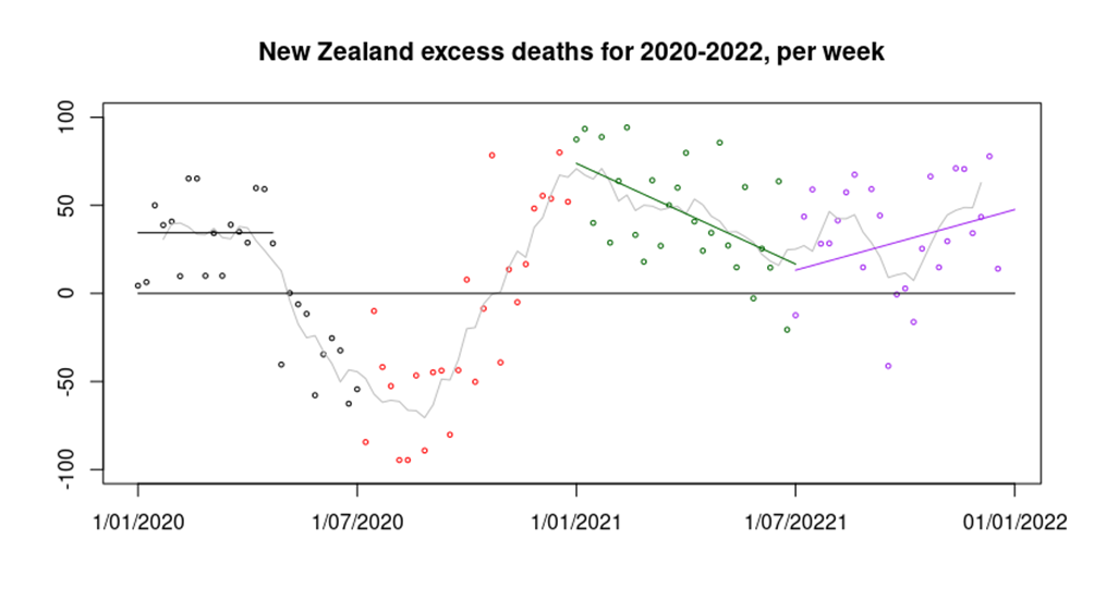
One other aspect of the data coming from New Zealand that is of interest relating to Covid is excess mortality. These data are of interest because New Zealand managed to keep itself more-or-less clear of Covid until the last few months of 2021, and even then case numbers were very low until 2022, with the result that Covid deaths were negligible prior to 2022. With that in mind, its excess death data between the start of 2020 and the end of 2021 are very interesting.

Many countries around the world had a peak in excess deaths in the first quarter of 2020, followed by a significant reduction in deaths into mid 2020. There has been speculation that this pattern was seen because Covid infections in early 2020 killed the most vulnerable, leaving a period in which there were fewer people left to die. However, New Zealand also has this pattern of excess deaths in the first half of 2020 (black data points in the graph above) without Covid infections, suggesting that the reduction in deaths seen in mid 2020 were a result of lockdown. The reason for the excess deaths in New Zealand in the first quarter of 2020 are not at all clear.
Most countries then saw an increase in deaths towards the end of 2020; this has been explained by a resurgence in Covid cases. However, New Zealand saw a similar pattern without Covid infections (red data points). It is possible that this increase was caused by the impact of the reduced healthcare provision during the extreme lockdown – though there are no data to support this supposition. There are reports that the New Zealand healthcare system experienced its busiest summer (January and February) on record with hospitals across the country reaching ‘crisis point’ and several emergency departments at capacity. The cause of this healthcare pressure is unclear, however.
Perhaps the most interesting data in the graph above are seen in 2021. During the first half of 2021 excess deaths slowly reduced from the high seen at the start of 2021 (green data points), perhaps a result of healthcare provision returning to normal. However, around mid-year the trend reversed and excess deaths started to climb again (purple data points). Again, it must be pointed out that there were very few Covid cases in New Zealand at this time, and negligible deaths. Just about the only unusual things occurring in the country at that time were a lack of international travel, restrictions in day-to-day activities for the population and an enormous mass vaccination campaign using novel, under-tested vaccines.
During 2020-2022, there were approximately 2,000 excess deaths in New Zealand, a significant number in a country with a population of five million. We don’t know the proportion that occurred because of lockdown, vaccines or something else; all that we do know is that they weren’t a result of Covid.
Note on data analysis methods. Infection, hospitalisation and mortality data were obtained from the New Zealand Ministry for Health (using Wayback Machine for historical data). Vaccination data were also obtained from the NZ Ministry for Health. Population data were obtained from Stats.govt.nz. Vaccination data were offset by seven days for the infections analysis to account for the Ministry for Health’s definition of vaccine status at infection. An additional seven days offset was applied for hospitalisation, and 14 days for death, to account for the typical timescales of disease progression.
